I always think that a card looks so much better with some kind of texture to the actual background and embossing folders can fill that requirement so easily for me.
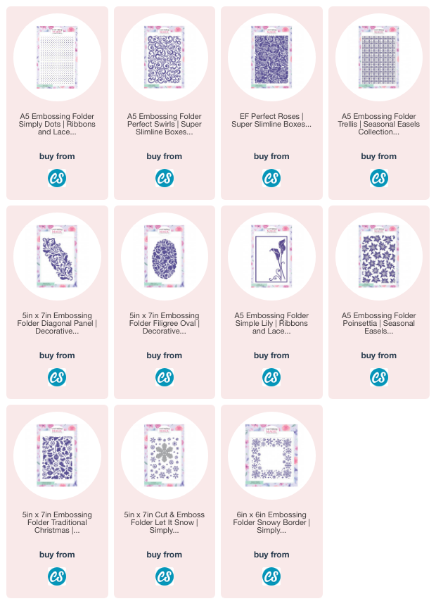
This one has the Simply Dots A5 Folder and is layered with gold mirror card.
For me it always adds that little bit extra and give the card that finished look.
You add another effect to the background like ink splattering or stamping and then add the embossed look to the top.
That is simply where you add ink to one side, add the card and close the folder, then run it through your die cutting machine with the embossing mats.
One side will give you an embossed look with the ink and if you ink up the other side the look will be debossed.
This simple flower design has the Letter Press added using the Trellis Folder and it compliments the overall design.
Whatever you design and whoever it is for the added detail to your card makes it even more special and is sure to be appreciated by your recipient.
I like to use a 300gsm card with my folders as that gives a really good impression without the card splitting.
You could also try a light spritz to the card before adding it to the folder for another way to get a deep impression and stop the splitting.
And there are lots of 3-D folders on the market to add a lovely look to your creations and embossing folders are so cheap to add to your own stash


Delightful cards Christina. I agree a textured background does make a difference.
ReplyDeleteJoyce x
Beautiful folders x
ReplyDeletePretty cards , the gold and white is a real standout for me.
ReplyDeleteI need to use my embossing folders more, I realize I just don't use them much, I love all your creations!
ReplyDelete