Beautiful Card Designs Made Easy

September 12, 2024

Bokeh Effect

Hi Everybody,

Todays little card is created with the Bokeh Effect on the front panel and there are many different ways to obtain this look.

It is a Japanese word often used in photography and it means blurred. 

This effect is that the back ground looks blurred, like the lighting in a photograph that is taken from a distance and it is not focused correctly.

I have created mine with Distress Oxides, and a large finger dauber and stencil but you can use anything that you have in your crafty stash.

It us another easy way to make individual and unique backgrounds for your design and is far more satisfying than buying more papers.

The sentiment is one of a set that I got from Amazon and is one I reach for often.
The top is cut in a blue to math the pattern and the base is silver.
The panel has also been mounted onto a blue mat 

This is a video I did on the technique some time ago and in that one I used water colour paints.

 I thought it appropriate to add it again here

More tomorrow ...

Hugs xx 

September 11, 2024

Trellis Card - Variation Two

 Hi Everybody,

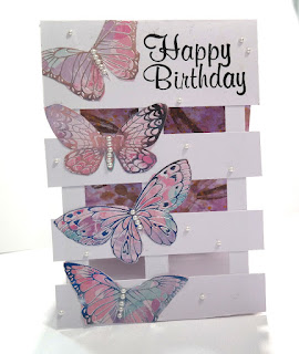
Today I am doing a different take on the Trellis Card from yesterday by simply moving the strips to another area.

Once you have tried this why not try them in another place for even more changes to your design.

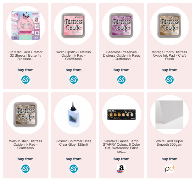
The video will show you how I got this look and I have used another handmade paper for the inside of the card. 

Such an enjoyable way to create unique papers for any thing you make


The butterflies are just cut from a paper pack that has been out for quite some time, but you could use ephemera packs or stamp and colour your images as you please.

The ones I had left over I added to the back of the card for more interest.

The video is not long and yet the card is so pretty and the finished size of mine is 5x7.

You can make this any size you want,  as there is not really any measuring to do, just adjust the strips to suit the size

More tomorrow ...

Hugs xx

September 10, 2024

Trellis Cards - Variation One

 Hi Everybody,
Today I am sharing a 
that has been made with a handmade panel for the back. 

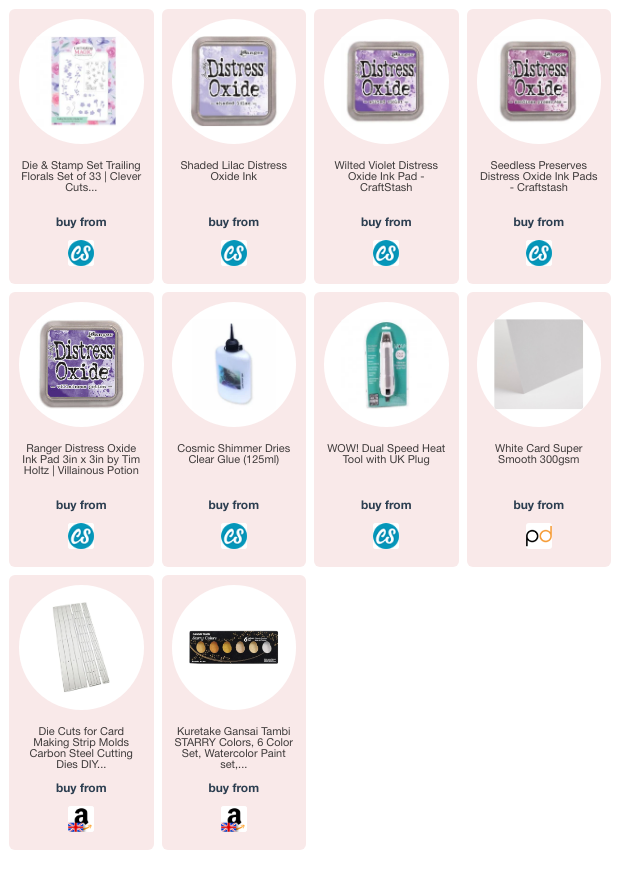
I really enjoy making my own background in this way and you can get so much variation in the finished card and I show you in the video how I get the look.

I got the idea for the ink smoosher from NBCards on YouTube and it is such a simple concept but so effective.

I have added this video to a Playlist called Trellis Cards and that will share with you many ways to create different looks with this simple design.

The card is easy to make and yet stands out from the crowd because of its unusual design.  

It is a style that has been around for a ling time ... I am just late getting on the bus !!

But I hope you enjoy the video and will come back for more as I have more ways to make trellis cards coming up in future videos.

More tomorrow ...

Hugs xx

September 09, 2024

Pocket Card & Variations

 Hi Everybody,

Today I am starting a new min series and I am re-visiting some old videos in the process.
I am going to make cards from one basic shape and give the old videos  a new lease of life.

Pocket Card
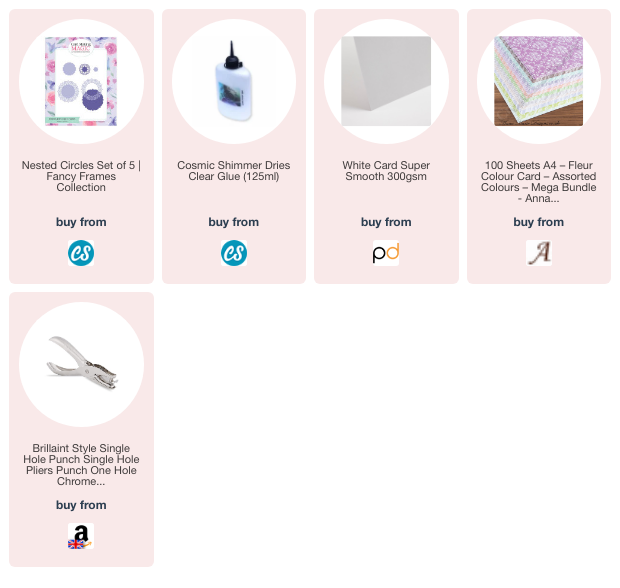
I have not bought anything extra, I have just used things that I already have in my crafting stash.

I have used the same die set throughout for my decorations and it was released a long time ago from my Nested Circles Collection 

The first picture is a complete pocket card and the video will show you how to get this look.


You could also simply leave the flaps loose and decorate the inside with the detailed layer if you prefer. Thus giving you two variations to use 

Side Fold Card


These next two cards are with the fold at the side, and it could be on either side.

I have used the die cut as a detailed lacey layer  that you can see through...


Top Fold Card

... and this one has the fold at the top using the detailed layer at the bottom to hold the card upright.

I have used a 300 gsm card, but if yours is lower than that the you may need to glue two detailed layers together for the strength to hold the card base upright.

This gives you three more variations on the theme to add to your arsenal.


This lilac card has the two flaps going in opposite directions but the card will still stand on its own.


For this I have cut the largest die to create a base, and I have added that behind the detailed layer,  to give this layer a more solid look.

But whichever way you decide to do this it will give you a really pretty card to send to your recipient, male or female and what ever the occasion. 

I hope you enjoy the video 

More tomorrow ...

Hugs x

September 08, 2024

Michele Coffey - Winner

 Hi Everybody,

It's grey and dull here today and I don't know if it will brighten up any, but here's hoping it will.

I am having great trouble walking at present and so I doubt if Ruby will get her walk today.
 I have an appointment with the doctor best week and so I am hoping they will be able to sort things out for me. First thing in the morning is really painful and getting up stairs takes me ages ... thank the lord for banister rails is all I can say !!!!

The draw has been done for the Spellbinders Set 3 and this time I am hoping it will be claimed.
The. name today is 

Michele Coffey

so could you send me your postal address lease to

christina@card-making-magic.com

and I will get it sent off to you straight away. Please let me know that you have it safely and I hope you enjoy playing with it when it arrives.

More tomorrow ...

Hugs xx