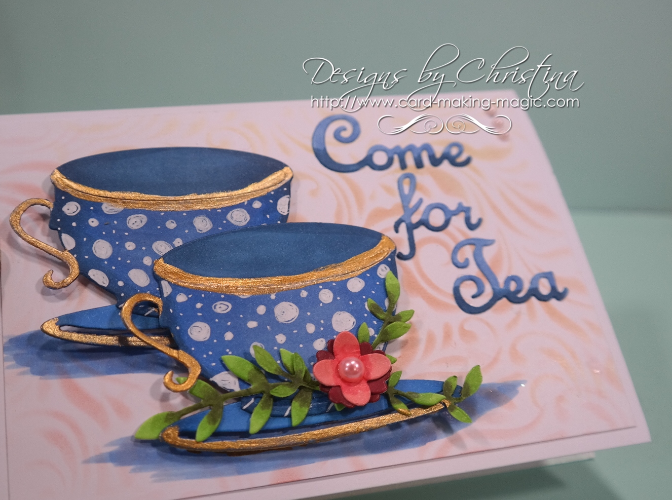
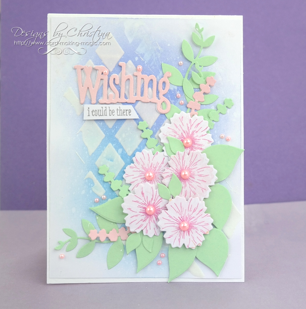
This is a card that I really liked the look of once it was finished. It was a magazine gift that I covered earlier this year and another that I enjoyed playing with
The colour scheme of yellow and blue was fresh and bright and I think they work well together.
If you think of the colours in nature then you can see examples everywhere of those that will work together ... and that is where I take a lot of my inspiration from.
Then go home and try to replicate that scheme on a card. If you like it then you will use it again and if you don't nothing is lost ... just start over. But there are not many colours in nature that will not work together
Use shades from the same family of either cool colours or warm ones on the one design, trying not to mix them together. Cool colours have tones of blue in them and warm colours have tones of red.
So look carefully at your paints, pens, inks, sprays, pencils or whatever medium you like to use and decide ... is it cool or is it warm ? Is it pastel or bold ?
Use a colour wheel to help you as that will show you where the colours sit in relation to each other.
More tomorrow ...
Hugs xx